Issue 2: GHOST
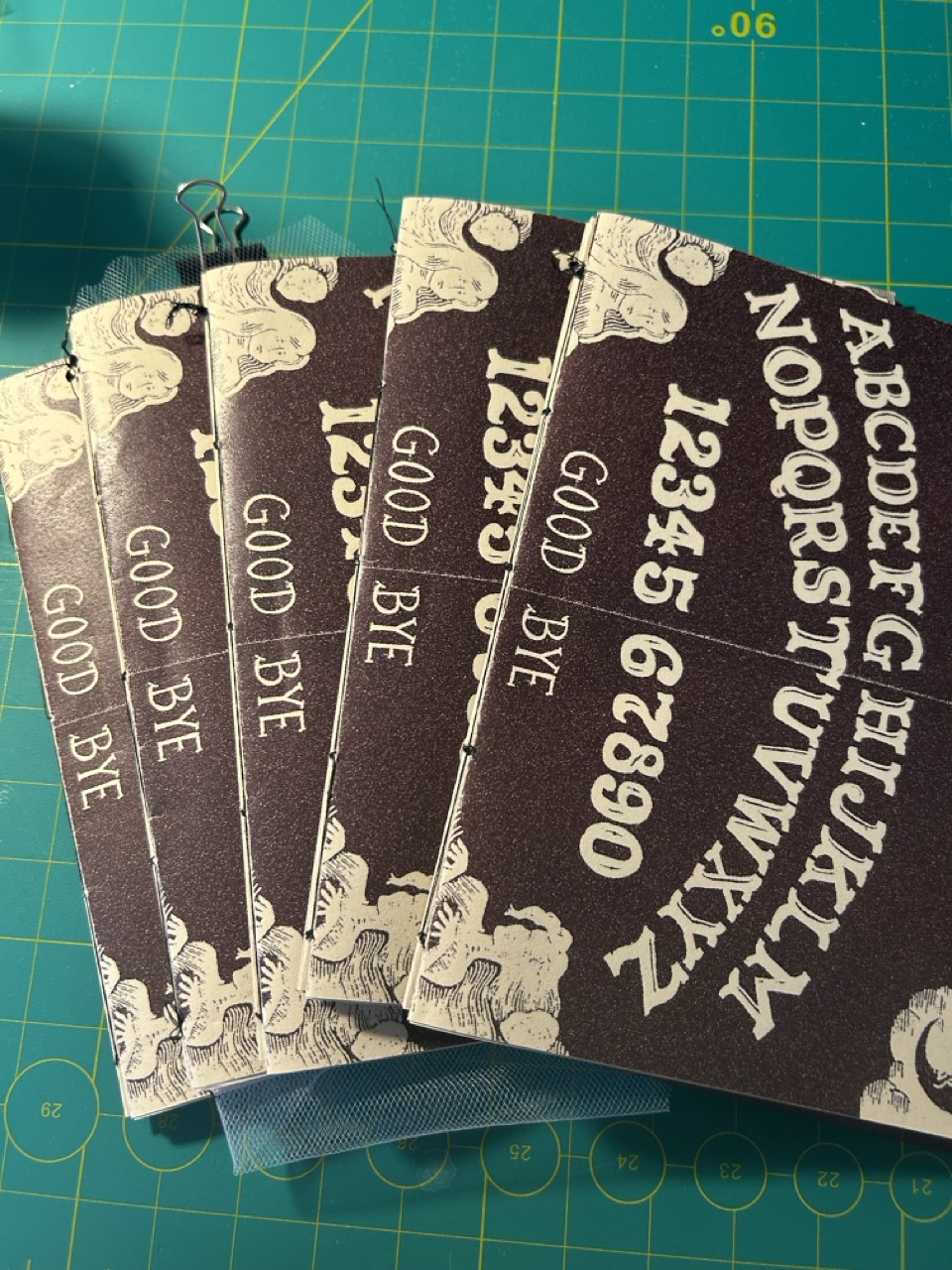
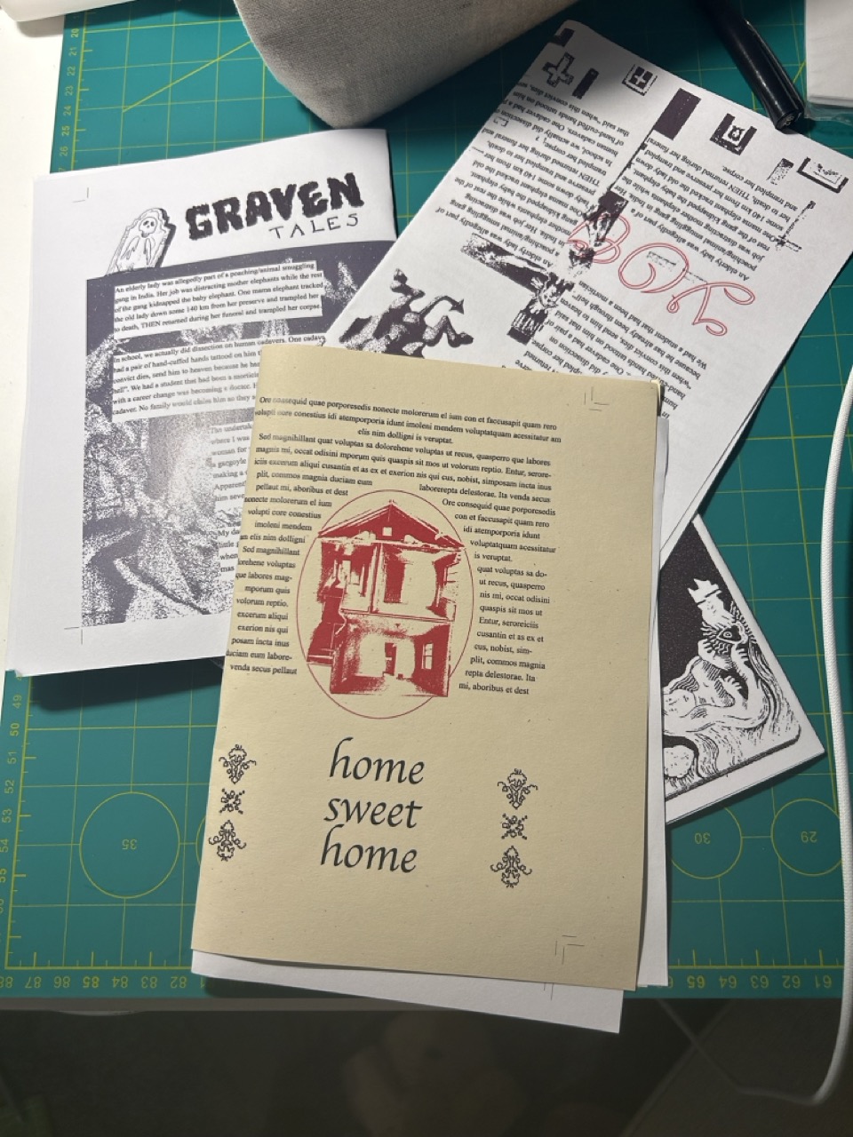
The second issue was alot more fun conceptually. I wanted to include different types of paper stock and materials as well as incorporate more interactive elements. With the theme it was easy for me to come up with some ideas but executing it would be a bit difficult.
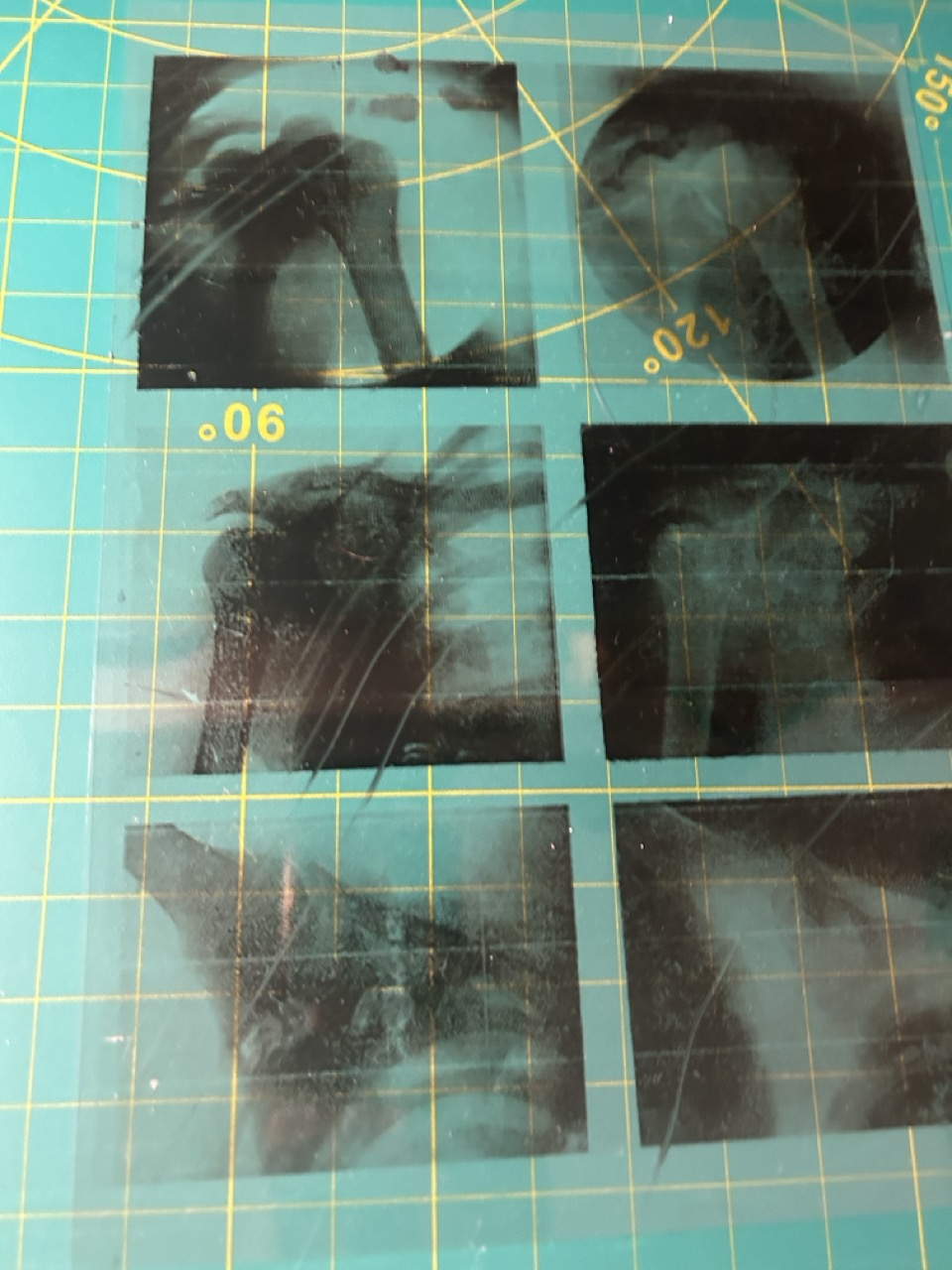
Things I found were successful was how engaging each spread was. Every spread was different or had something new than the other and it made for a very exciting experience. I especially loved the vellum paper where you can see a ghost super impose over a photograph. It's simple yet so effective. On to the difficulties:
- There were many printing errors relating to the paper type. For example I couldn't print transparent paper properly and lots of paper jams with the vellum paper.
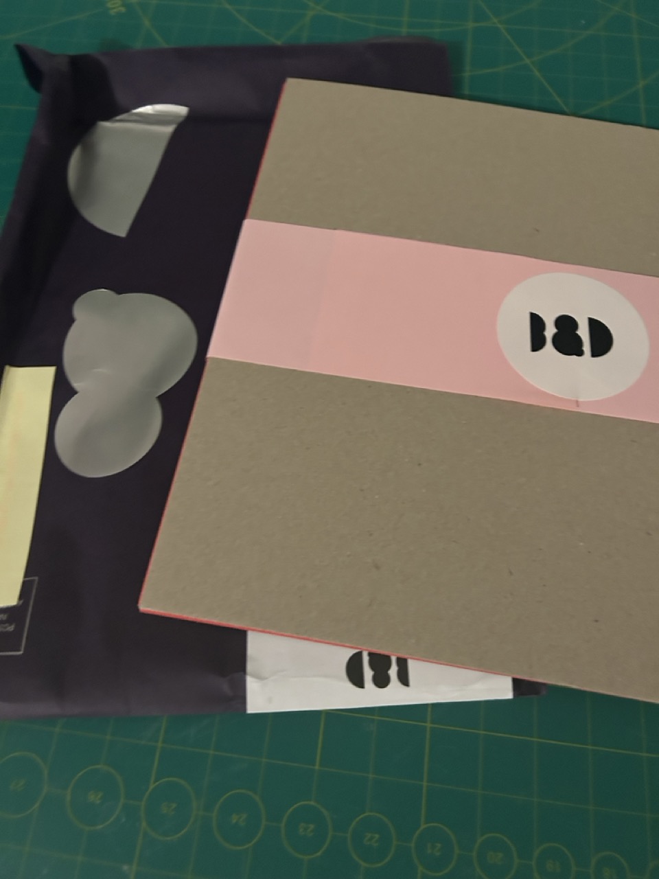
- Finding it hard to find a paper for my cover that matched the specific colour of red in my colour palette. I ordered samples from Ball + Doggett (which I was surprised by how simple it was and it was free) but none of the colours I liked. It was super stressful finding something but in the very last minute of the day it was due, Little Print managed to print copies of Kaskad paper that was exactly what I was looking for. Thanks Little Print!
- Binding was flimsy despite me spending alot of time trying to secure each signature together. I think this could be fixed with a more thicker thread such as embroidery thread.
- Trying to burn holes on the pages and nearly burning my house down. FUN!
- Working with materials other than paper was super hard such as the cellophane and the chiffon material. It was hard to bind them to the pages together.
- The design process took a while with any iterations and versions of a spread. It was hard for me make it visually consistent with the other issues whilst also making it evolve.
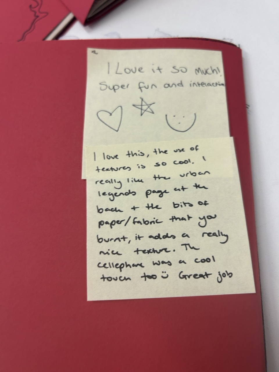
I received alot of positive feedback on the aesthetic. Again I think I secretly prioritise the designs more than the craft of the books which isn't necessarily a bad thing but when it's meant to be a polished version of something you would put out to the world and share with your friends in a physical format, I learnt now that it's important to have a balance of both. For the next issue I strived to fix the flimsiness and try to design less spreads than this issue.
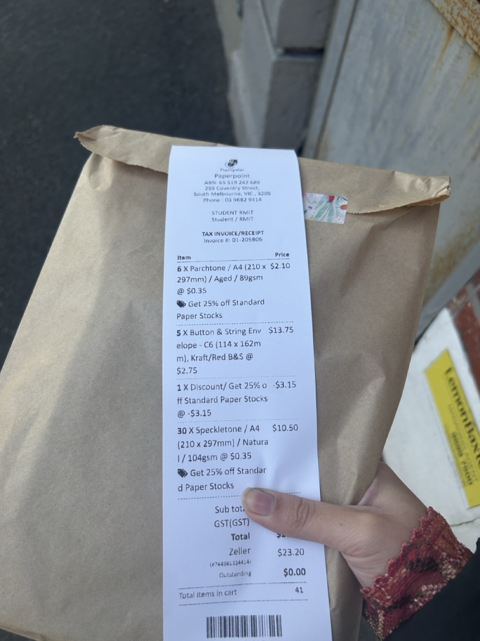
- Money Spent: Paper and Envelope - Paper Point = $23 / Mixed Colour Cellophane - Officeworks = $4 / 1 yard x Chiffon - Lincraft = $17 / 5x Kaskad Red Cover and Business Cards - Little Print = $30 // TOTAL = $74
- Time Spent per issue = 40 minutes to bind and organise pages.
